IBM Watson Studio Text Analytics
Improving the way a user trains their data and moves throughout the application
Project Summary
The Project
Take an existing SaaS offering, Text Analytics, and merge it into a hybrid cloud application: IBM Watson Studio. The application not only needed to use the Carbon Design System, but improve the user experience.
My Role
With a small product team, I was responsible for:
Interviewed internal SMEs and gathered qualitative data to extract insights
Lead and participated in group activities and workshops
Wireframing and prototyping solutions
Redesign with Carbon Design System
The Approach
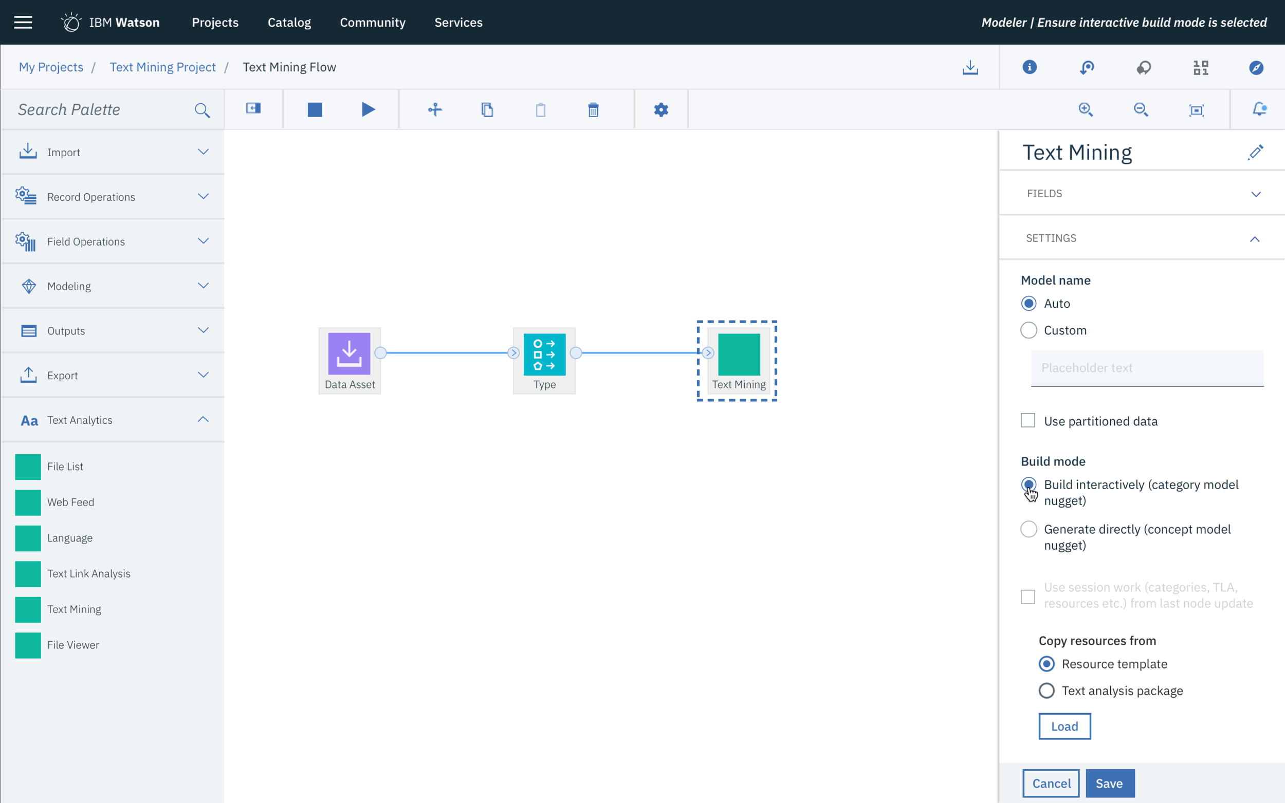
I after researching the problem space, I put together a design brief and aligned my team around the problem, goals, constraints, and outcomes. We used ZenHub, Box, Mural, Sketch, and Invision to collaborate on an agile focused design methodology.
I conducted shadow sessions and user interviews to better understand how things were currently being done (and why); discovering pain points, must-haves, and nice-to-haves. This helped me built context and better understand my primary user.
My team rapidly designed and tested wireframes and tested with users to get an idea of what was working and what wasn’t. We regularly received feedback from designers and developers across the organization.
We finalized the design as a concept car and got sign-off from our executive stakeholders and development team.
The User: Debbie The Data Scientist
Wants to…
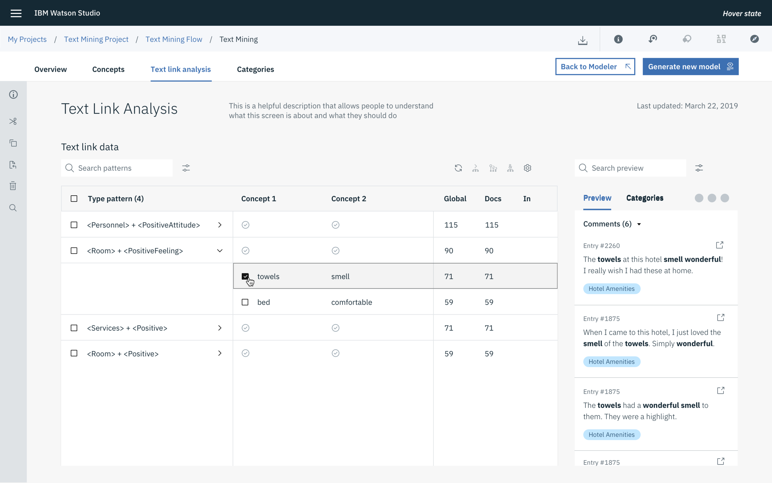
Turn text into data for analysis
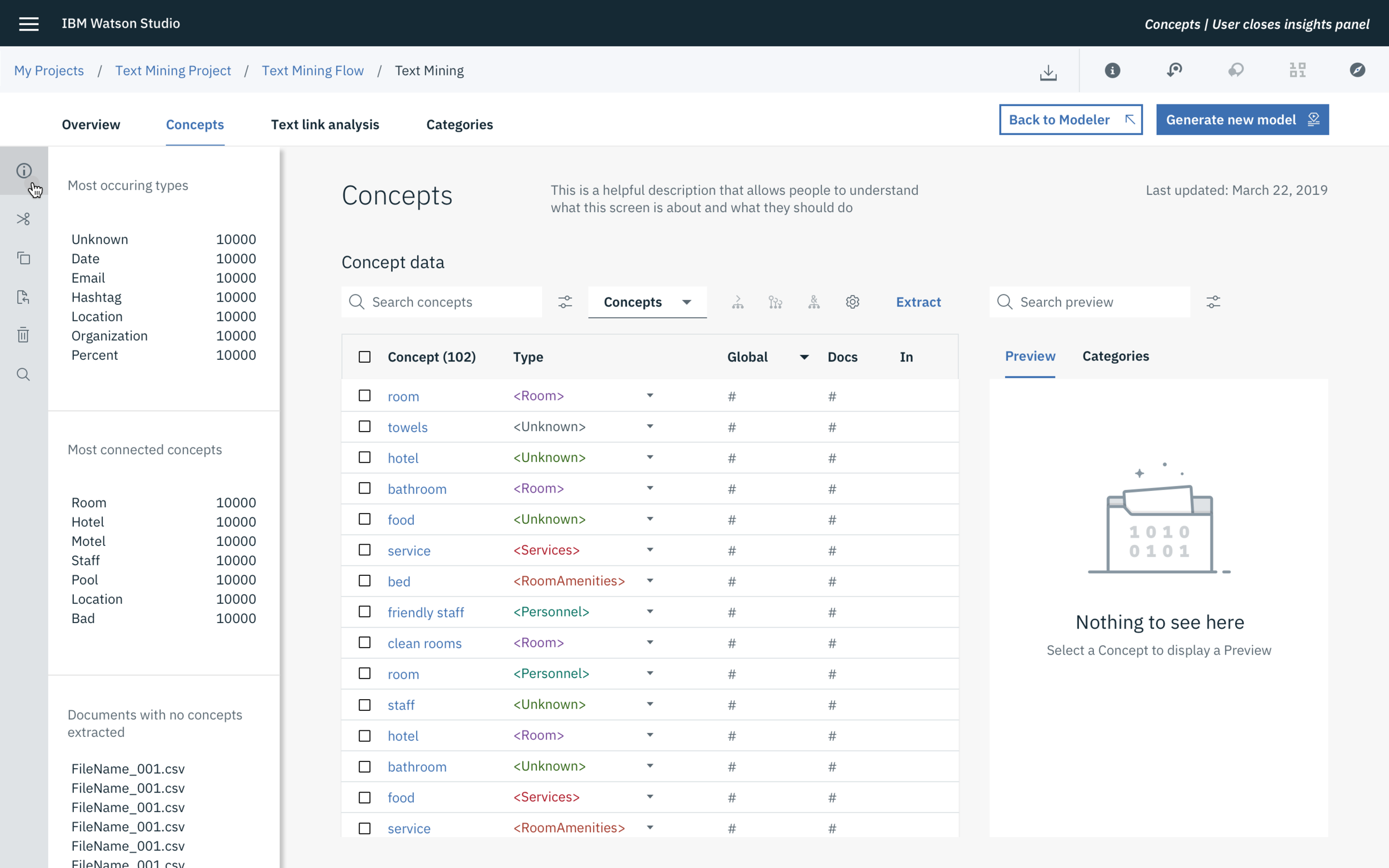
Extract and organize key concepts
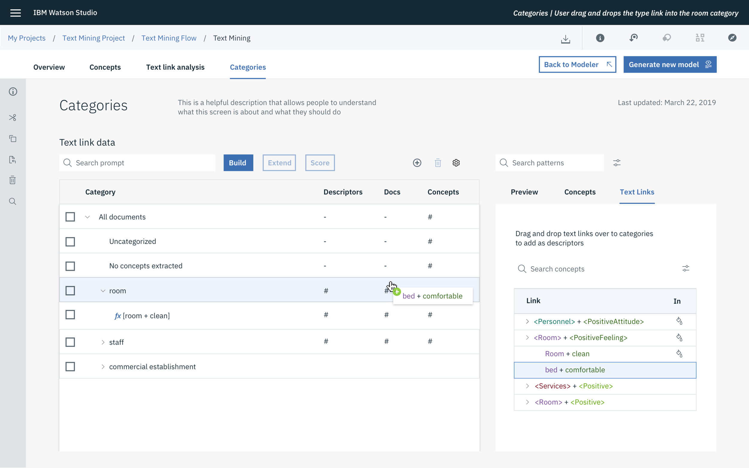
Group concepts into categories
Scenario: Hotel Satisfaction Comments
Discovery Process
We interviewed internal subject matter experts on the current state of Text Analytics and asked them to complete tasks regarding the data cleaning process. We also used NPS scores and customer feedback to gather insights as to what was working and what was not working in the product.
We took the pain points from the qualitative feedback and asked our internal SMEs to score and order these pain points in a card sorting exercise. Finally, we created a user journey / empathy map to identify where in the flow where we would need to make improvements.
Discovery Summary
The navigation in the product was unclear and people struggled with understanding the next steps in the process.
“Did I get everything?
“I need help with the process”
“Is there more to do?”
Understanding As-is
We mapped out the as-is scenario to understand the step by step process of the current cleaning process. We used the data we gathered in the Discovery process to outline pain points along the journey.
Exploring new Information Architecture
Because the navigation was unclear, we decided to rethink how the product was organised and see if that would clarify the data cleaning process.
I collaborated with 2 other product designers to come up with different information hierarchy designs that we thought might help solve the navigation problem.
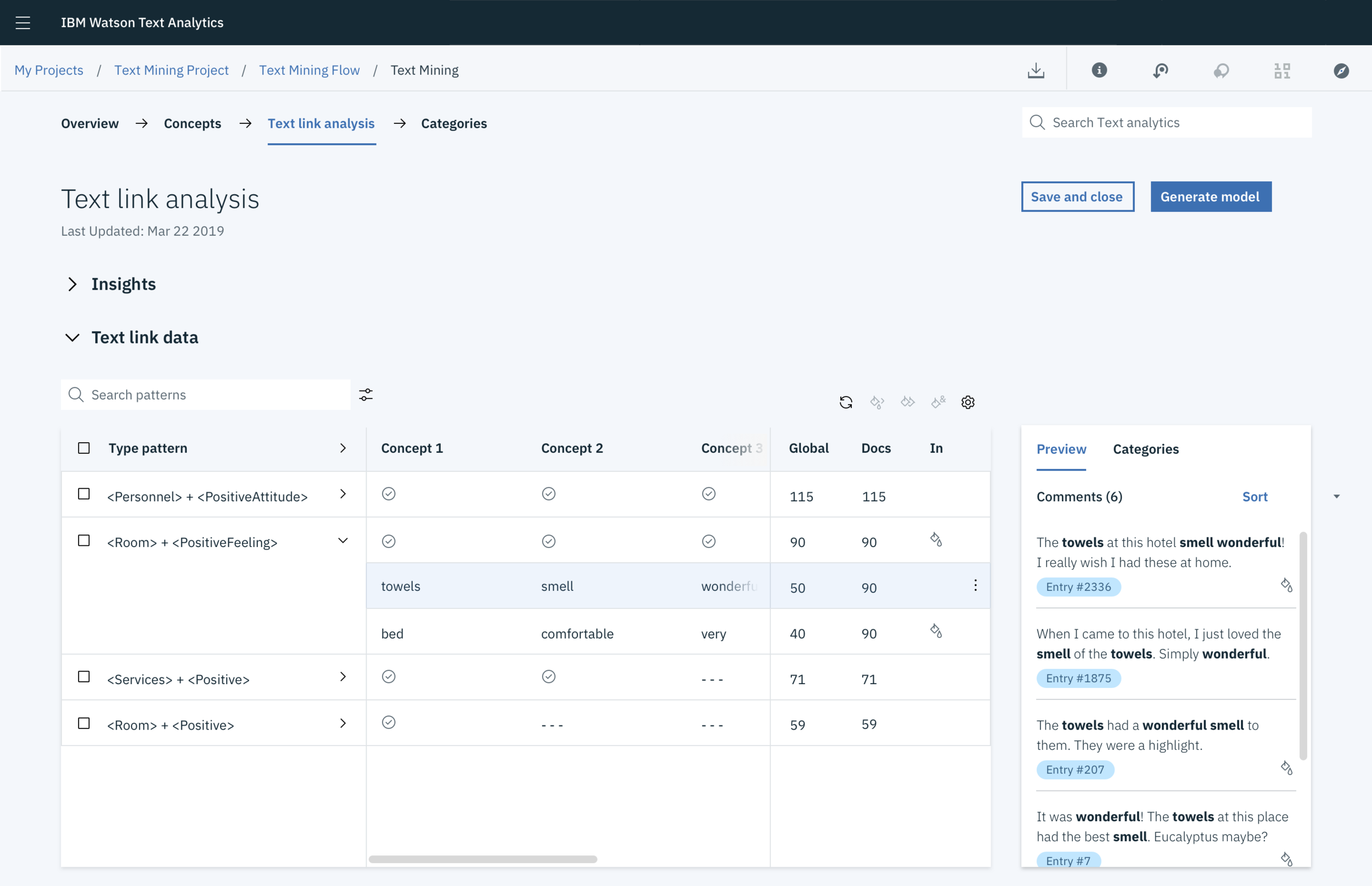
Guiding Navigation
We decided to add the navigation near the top of the page, under the product’s global breadcrumb pattern, in the order the user is supposed take to train their data set. We iterated on a few ideas before settling on an idea that resonated with our internal SMEs.
Prototyping
For our business stakeholder playback, we built a prototype using InVision for a step-by-step walkthrough with stakeholders and engineers.
